Storytelling
Gemini
Make Static Charts Insightful with Scrollytelling
Problem
Traditional dashboards focus on exploration, not explanation. Stakeholders often ask for raw exports or additional breakdowns, while the core story and insights get lost among charts. As a result, dashboards become collections of visuals instead of decision driven narratives.
Solution
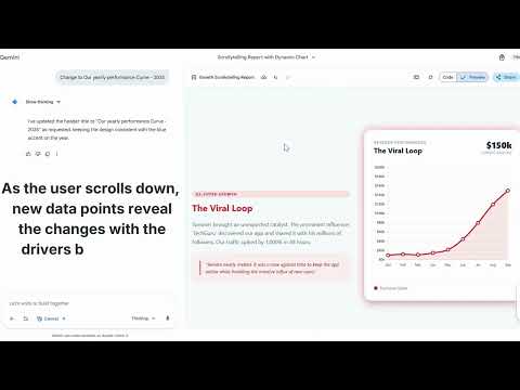
Use scrollytelling to transform dashboards into contextual data stories. By combining HTML reports with scroll triggered chart updates, teams can guide attention, add narrative context, and highlight key insights step by step. These patterns can be reverse engineered into reusable templates and embedded into Cursor workflows. The outcome is a shift from delivering data to delivering understanding and actionable insights.
Prompt
generate a single-file HTML report using Tailwind CSS and Chart.js. Create a Scrollytelling layout where the left side contains long-form text and the right side is a sticky container for a line chart.


Data Logic: As I scroll, the chart should update.

When the user reads 'The Plateau' section, show only Jan-Mar data in Gray.
When scrolling to 'The Pivot', animate the line to include Apr-Jun and turn the line Blue.
For 'The Viral Loop', add Jul-Sep and pulse the line in Red.
Finally, show the full year in Green.
Use IntersectionObserver API in JavaScript to detect which text section is in view.

Here is the data:

MonthRevenue ($)MilestoneStory PointJan-Mar10k, 12k, 11kThe PlateauGrowth was stagnant; we were burning cash without retention.Apr-Jun15k, 22k, 45kThe PivotWe launched 'Community Features.' Engagement tripled overnight.Jul-Sep80k, 120k, 150kThe Viral LoopInfluencer 'TechGuru' shared our app. Servers nearly melted.Oct-Dec145k, 160k, 185kThe New NormalStabilization at a high floor. We are now market leaders.
Walkthrough